


The Horowhenua Company Ltd
The Client
The Horowhenua Company Limited (THCL) are the independent Economic Development agency in Horowhenua who undertake activities and projects to help and enable the Horowhenua NZ Trust (HNZT) - another organisation we have worked with, and developed an identity for - to achieve their mission to improve the social and economic wellbeing for all of the district. They champion Horowhenua by identifying and attracting investment.
The Need
THCL wanted to distinguish themselves from the trust itself and stand alone whilst retaining some existing visual ties. The trust was branded in 2018 and THCL had an ‘in the background’ logo created for them while they grew. Once grown, it was time for a brand refresh, especially as THCL are public facing. The client wanted to be known as ‘THCL’ rather than the long and wordy ‘The Horowhenua Company Limited’ full title alternative.
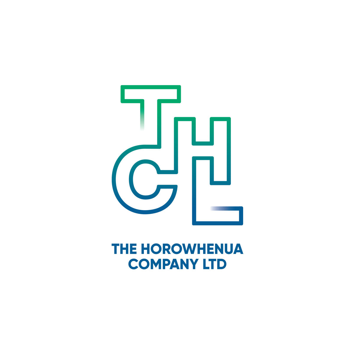
The Concept
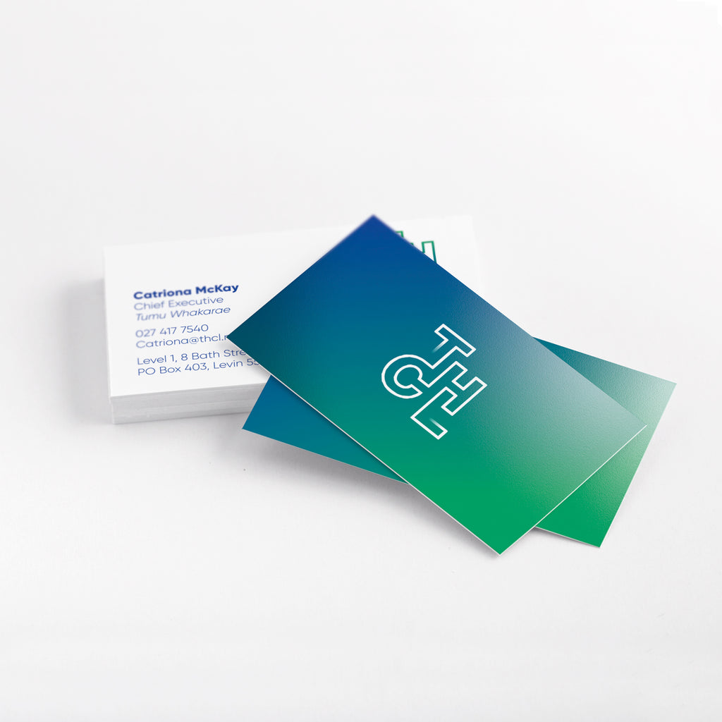
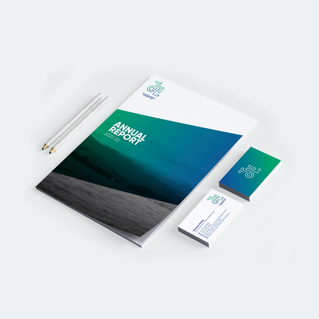
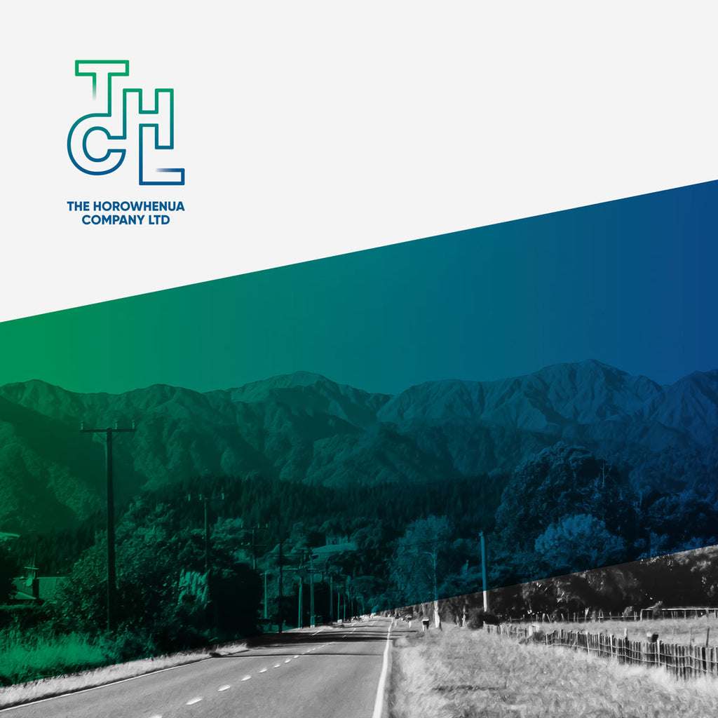
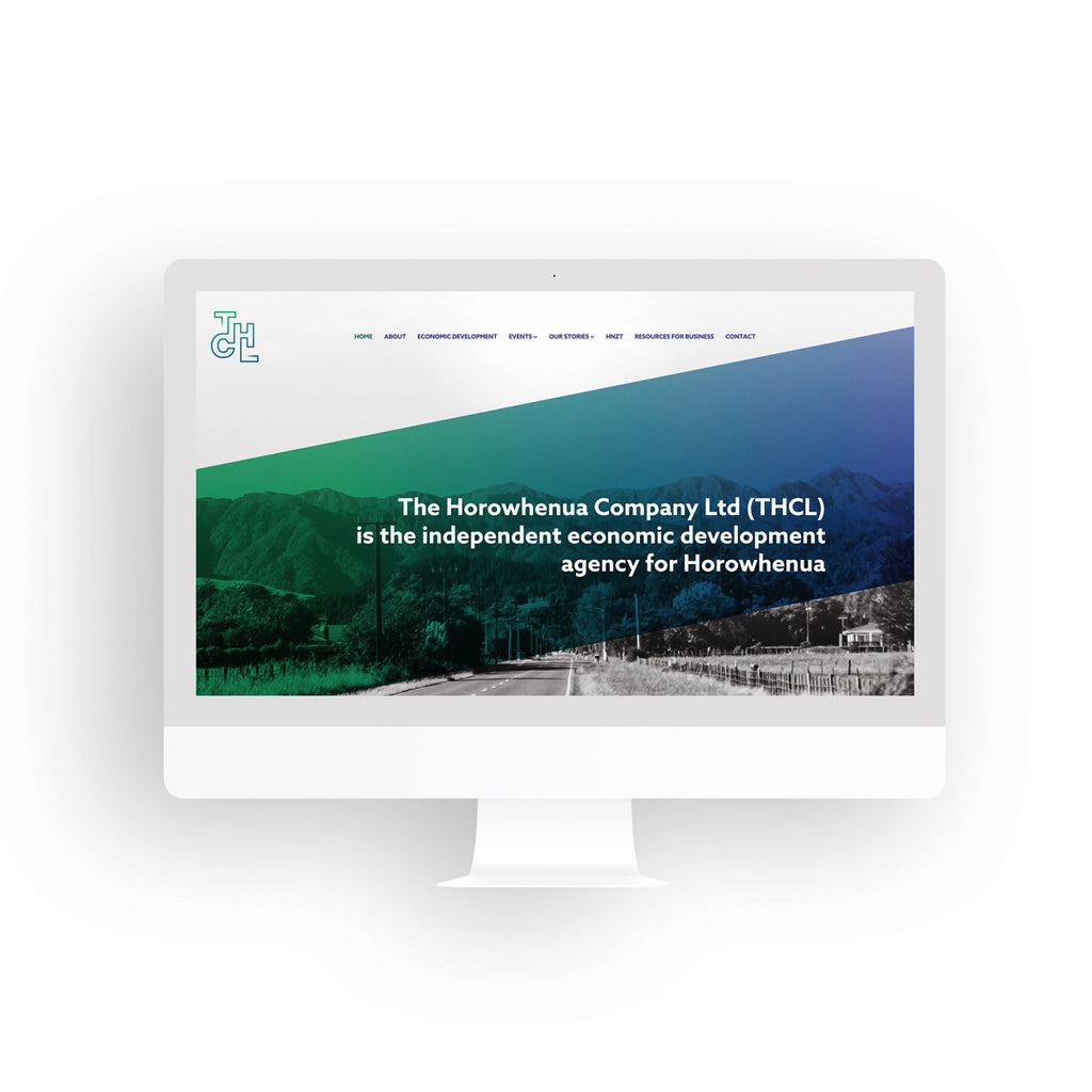
As success is not a straight and uninterrupted line, we designed the THCL letters to all be connected with ends that fade out to symbolise that business and economic development is continuous. We brought in the green and blue from the HNZT colour palette to link back to the trust. Green to represent go (implementation), for achievement and growth. Blue to represent foundation, strategy and professionalism.
When you blend these two colours, stunning teals and emeralds emerge representing everything inbetween strategy and implementation. Overall the look and feel is super clean allowing the gradient to do the leg work it looks striking when overlaid with black and white images of the district. Simplicity was key. A ‘less is more’ approach successfully achieved.
The Execution
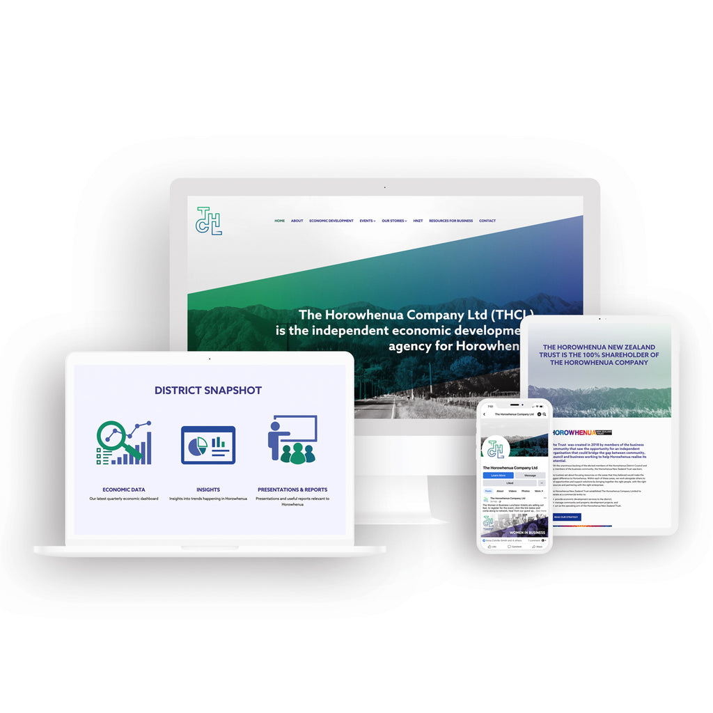
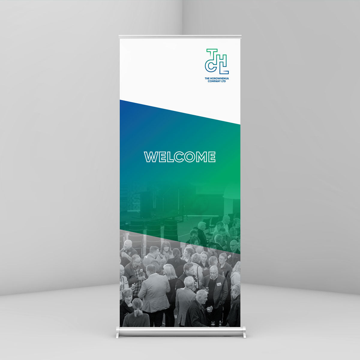
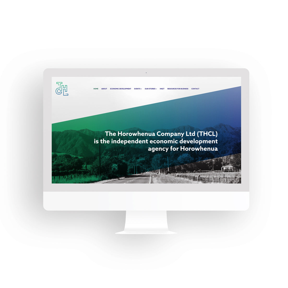
We developed an overall identity that was then applied to stationery, pull up banners, economic reporting templates, presentation templates, a website, social media graphics and e-news templates.
The Testimonial
Branding exercises can sometimes be fraught, and multiple voices and opinions can cloud / dilute the end result if not managed. So, we were delighted to receive these kind words when they signed off the branding designs in a meeting at board-level.
“This was one of the quickest and least painful branding exercises we have been involved in. Lemonface Creative have been awesome in all their dealings with us. They’re a perfect example of local talent who ‘get us’.
Catriona Mckay (Chief Executive) & THCL Board
All in all, a memorable project.