The Background
Australian canine apparel + care/grooming products company Rogue Royalty came to us in 2021 to create a visual identity for its sister brand Rogue Raw. Rogue Raw is the middle finger to the commodification of animal health in the pet food industry, highlighting a premium raw food diet. Its identity needed to reflect the seriousness of its purpose, its values and also its premium nature. It needed to appeal to the pit bull owner and the poodle owner. Communicate its quality as well as its fight.
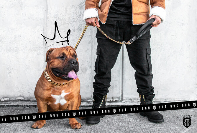
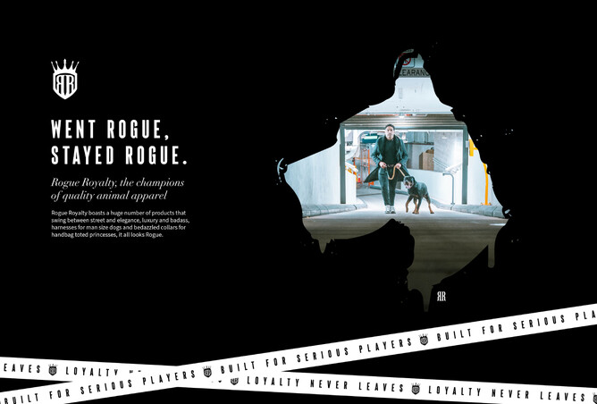
Bat Dog was born and perfectly represents the Rogue culture, vigilante, breaking (stupid) rules and walking its own beat with its head high. The new icon and associated collateral shines across the website, socials, packaging and everywhere Rogue Raw goes.
These aren’t just two businesses though, they’re a challenge to the status quo and have been built by the sheer tenacity of Director Wendall van Jour - in an industry saturated with the piss of the big dogs, this underdog dares to cock its leg. Naturally when you create something built on strong values and your own blood sweat and tears it’s terrifying to put your identity in the hands of someone else.
Over time we’ve built trust to the point where Wendall came to us seeking a more cohesive visual identity for the mothership, Rogue Royalty. Wendall has built a whole culture championing quality animal apparel, grooming products and food - fighting for the option that’s actually best for the animal, and wants to do the same justice to the branding and marketing.
The Brief
Wendall came in with a big headache. His head was hurting trying to put together social posts that looked and felt like the well-known and respected brand he’s built. When you’ve got a large busy business, lacking direction can feel like being totally out of control and like not doing your baby justice. He wanted NEEDED a formula to guide how he creates branded marketing material.
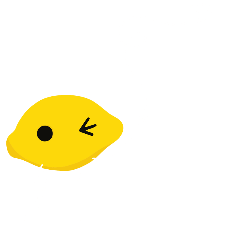
"somewhere a little lemon started rubbing it’s zesty little palms together with glee"
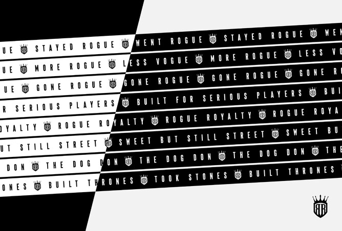
Given that Rogue Royal boasts a huge number of products that swing between street and elegance, luxury and bad*ss, harnesses for man size dogs and bedazzled collars for handbag toted princesses we needed a way to pull everything together so no matter what, it all looks Rogue.
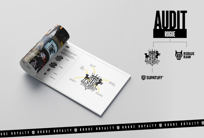
Straight away we know we need a Brand Audit - let’s see what’s already there. Once we’ve got an overview, we’re into a Brand Workshop to get clear on the message and once we’d got all that together - there needed to be one document to rule them all (mwhahaha yes, hobbitses) with easy formula so he or any team member could DIY marketing material.
The Work
Audit - look at everything they have, from gold chains to leather muzzles, weight vests and everything in between. They don’t ‘go’ together, but they really do. Look at what works, what doesn’t, what to keep and what to archive i.e. photography styles that don’t fit the vibe.
Brand Workshop - extracting everything from that poor business owner's sore head. Get clear on the core of what they do. The big picture.
Moodboard - a picture paints a thousand words, a visual vibe.
Brand Assets - identify assets that could work for Rogue Royalty, Supatuff and cross over to Rogue Raw if need be.
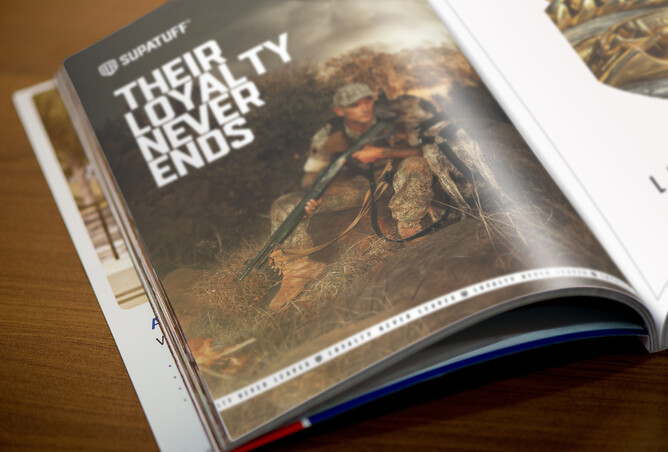
Supatuff Logo - Supatuff is a very popular sub brand of Rogue Royalty and needed its own logo that fit within the family suite.
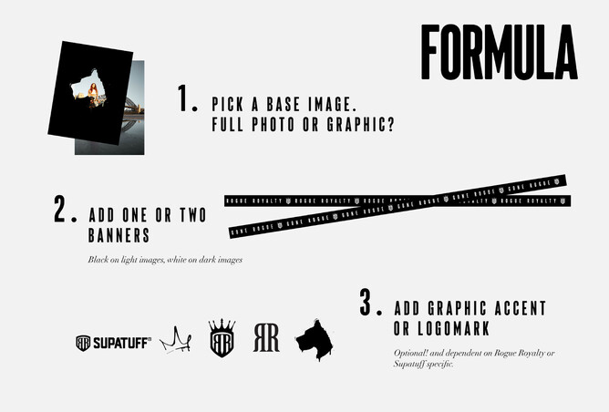
Brand Guidelines - this is The One Document to Rule Them All. Anyone can pick it up and use it to create on-brand marketing materials for Rogue Royalty. No room for excuses. The One Doc outlines clearly how to use the logo(s) as well as examples of how to use the brand assets* for the different product lines. This formula allows all products to fit in and stand out.
*Brand assets like graphics, by-lines, banners, typography, photography"
Social Media Templates - we created these with a market leading program in basic graphic design, we chose it for its availability, ease of use and cost effectiveness. There’s no point having a fool proof formula for content creation if you don’t have a fool proof program to create it on.
The Challenges
Too many ideas, so many products and elements that don’t tie together. The Lemonface super power is simplifying all of that down (juicing?!) into a powerful concentrate that contains all of the superpowers and nothing else. Oh yea, it’s definitely juicing.
The passionate client overthinking – the audit and brand workshop address this – getting everything out of their head clarifying the creative direction in a way that the client is able to see it. Once we see it, we agree on it and then we document it.
We needed a way to visually market very different products in a way that made it clear they were still part of the brand family – a system for the brute and the boujee. This meant balancing the vibe – vogue but also street, tough but also sweet.
Creating the formula was also an exercise in simplification. Juiiiiiicing.
The Result
A super happy and empowered client. Because we’ve worked together from the audit, through the workshop and to the templates and The One Doc to Rule Them All, Wendall knows why we’ve chosen all the elements and their purpose and exactly how to use them together to grow his brand awareness and strength in the marketplace.
This is a project the client and designer can beam about in equal measure.
The Feedback
"Sarah-Jayne really KNOCKED it out of the park not just once but many times across several projects including branding, graphic design, strategy and style guides.
The standout is Sarah-Jayne’s talent to extract, interpret and express what’s inside us as a company and process that into something real and tangible.
She is refreshingly candid, no fluff, no BS and has a pragmatic approach whilst still being a creative artist who can comprehend and converse at different levels.
This is a very powerful (and rare) blend for those looking for REAL business results because she helps traverse into your brand target area and psyche …many designers cannot or don’t do this and sure, but they design and produce what they think is “good design” in their own perspective.
We genuinely love Sarah-Jayne's work and her approach. All this coming from a hard to please fussy freak too. "
View this work in our portfolio.