The buds adorning branches are threatening blossoms and thank frolicking goodness for that. Winter can hippity hop out of here and spring can get to springing. Give us longer days, give us gorgeous spring light and give us the promise of bloom and bumble related road trips with the @lemonfacelens.
Alas, this is an update about the work we’ve been up to.
Last we spoke we’d been leaning way into connection and sharing our particular set of skills to help out fellow business owners. The brand clinics have been super interesting, not one the same, but all with the same goal - look good, get more work. We’ll have done a total of 10 by the time we wrap up this coming week. As a result of these many conversations we have a few new services in the works to fill the gap between in-house designer and DIY. Juicy.
Oh, and we featured in Captivating Photography Journal, Discovering Art in Everyday Moments.
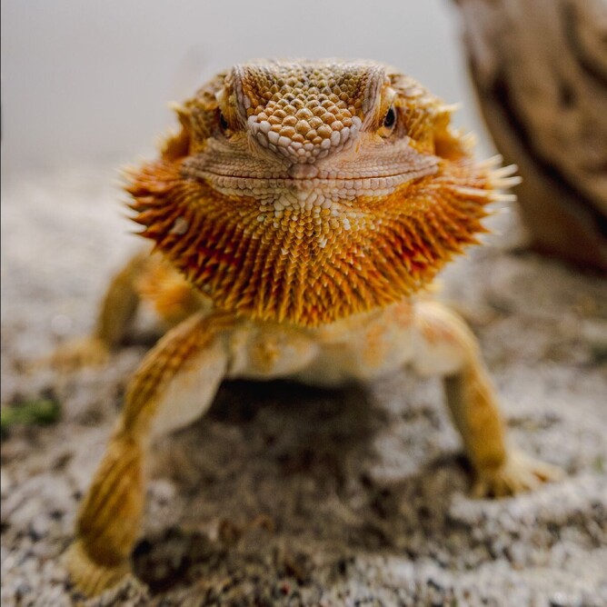
“I enjoy details. I will often be found taking pictures of herbs and spices in a hot pan or the way the light plays with my full wine glass, an aphid on the roses or trying to capture the tiny scales of my Bearded Dragon, Boo.”
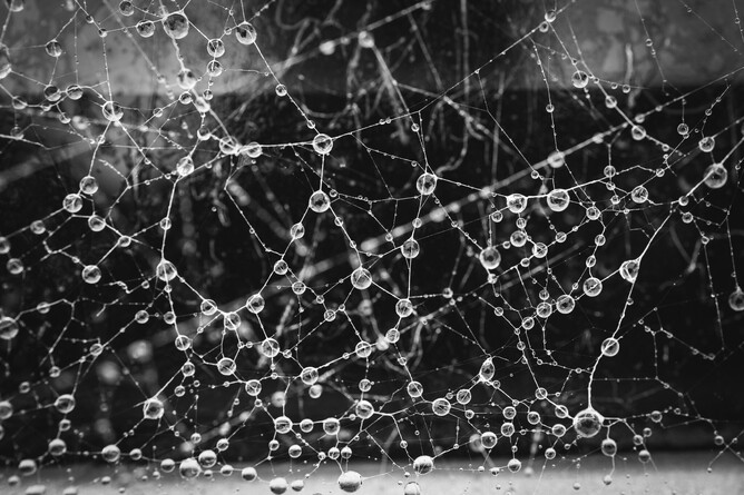
Here is a snap from the article of water drops on a rather elaborate web, you’d never know it was from the back windscreen wiper of a car!
Latest Projects
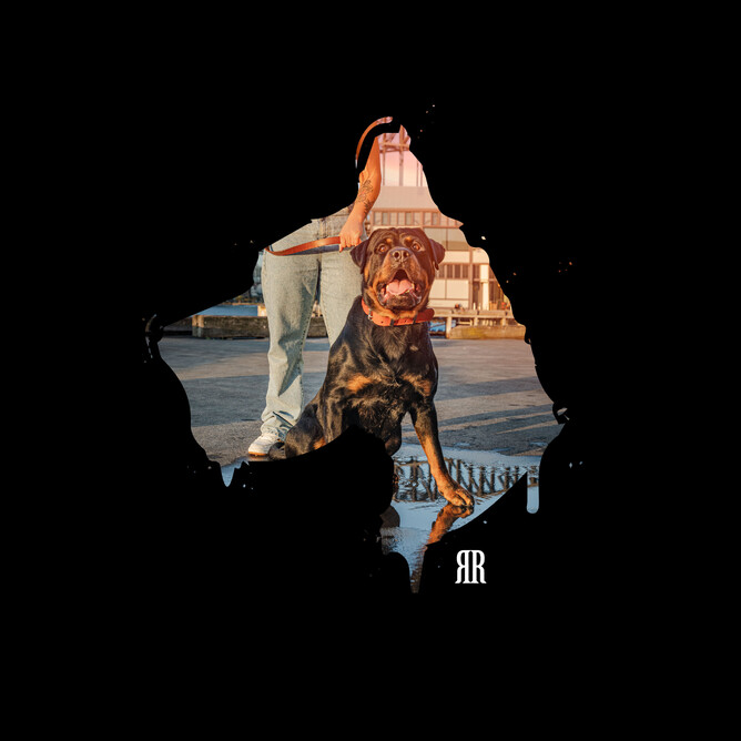
Rogue Royalty look and feel overhaul
An exciting project undertaken in the last few months was the complete overhaul of Rogue Royalty’s look and feel. We began with an audit, meandered into a brand workshop and completed a DIY kit of brand assets for social media. You can read the Case Study analysing the work we’ve done with Rogue Royalty, laying it out like this is a great way to view the twists and turns getting from brief to delivery.
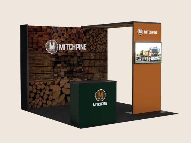
Mitchpine Expo Site Design, Collateral and Print
This nearly 50 year old (what?! What an achievement) local family company is always adapting and innovating, this year they decided to invest in their industry trade expo presence. Because they always do things to the best of their ability they enlisted the help of us local creatives to help design and produce their site set up and all the print materials needed to hand out to attendees.
Putting in this effort and presenting themselves with such a slick visual brand announces before any conversation has been had or any case studies have been read that this company means business. Psychologically translating to an equal measure of pride in their product, people and standards.
You can check out more of what we have created for Mitchpine in our portfolio.
Brand Identity for Lorraine Hamilton
This project was a bit chicken before egg. Egg before chicken? Lorraine already had a colour palette and typography she loved because she was in the process of her website redevelopment. What she didn’t have, was branding that showed off her personality. She is her business, the business is Lorraine Hamilton!
We started at the beginning, a very good place to start, I listened while she talked about her business journey, her aspirations and values. We moodboarded. From this, I could see her emerge visually and then I went and squirrelled away on some concepts and we landed on this one!
She says it was obvious! A no-brainer! But it took Lemonface to see it, create it and then hold it up like a mirror. Ta-dah! Professional with personality.
You can have a look at the whole picture (look and feel) of her brand on our Instagram.
Out and about
The free brand clinics have had me out and about this month, granted, mostly to the local for coffee but there’s no one mad about that.
We attended a networking event in Porirua. The theme was about defining our Vision + Mission statements into a bit of an elevator pitch. It was surprisingly useful to look at these again because they’ve definitely shifted in the last while.
I’m Sarah-Jayne Shine of Lemonface Creative,
I am a creative that likes to connect with and help others. I translate a business’s values and personality visually through graphic design and creative strategy. I want to be the designer that purpose-driven businesses turn to in order to connect with their audience(s) visually.
Must add a reminder in the notebook to review in another 6 months. When’s the last time you looked at yours?
Also out and about Sarah Jayne (moi) of Lemonface Creative crossed paths with business twin Sara Jane of Designer Bloom Graphic Design (yes you read that right).
- Both from England and emigrated
- Both graphic designers
- Both attracted to things that look pretty
I can’t tell you how much my little heart sings when I meet and get to know other creatives to add to my creative community.
Reflections
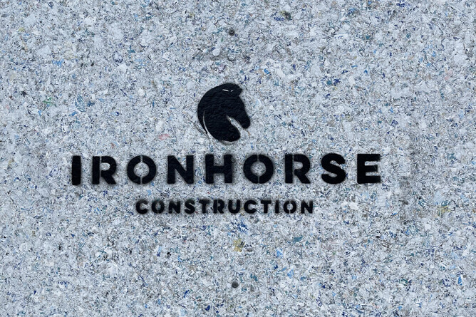
As I was out and about wandering in Welly I found myself looking up, so that’s the first learning - wherever you’re looking, look somewhere else.
Looking up I wished I’d taken time for photography on this day out, learning #2, bring the camera and add more time for wandering.
What I saw that was really interesting and really very clever, reminded me that signage and marketing can be done in so many ways. One that caught my eye was the Ironhorse Construction stencil on a work site - this was just spray painted on the job site, on brand and standing out, no extra bits needed. Learning #3, a sign doesn’t have to be a sign.
Through the @lemonfacelens
@lemonfacelens is a Lemonface outlet for creative expression, a place for play and joy. Here are a few views through the lens that stood out for us this month.
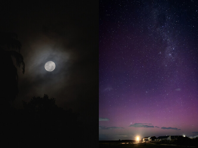
There are not many things that can entice me out of the house once the heels have been checked into the heel hotel and the Oodie has gone on but an aurora or a moon will do it every time. This one led me to a beautiful capture from a favourite spot in Foxton.
Boo the dragon
What I will say is she is trying to take a finger off and she hasn’t succeeded yet. Very savage. Not very demure. Giving dragon.